Developers Toolkit
Developers Toolkit is the section of the website you come to to make larger changes to your Union site. It's used to add / remove content as well as drafting / publishing content, restructuring the pages, navigation and more.
Contents
Pages (Tree View)


First things first, every Union will have a slightly different looking Tree View, that's because this is related to your site and it's structure.
To give a brief overview of how this works, I'll try to describe it as best I can.
- We think of the Tree View page, similar to an empty box, or a blank canvas, that is your website.
- You then need to add content to this box / canvas.
- Everything that you add that is not a sub-page, or a sub section, (so when you're setting it up, it doesn't have a parent) is treated as the top level of your website.
- Everything has to have a container.
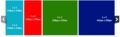
The example to the right hand side, shows the first segment on a tree view for a test Union Cloud site, and below it, shows how that matches up on the Front End. the simplest way to look at it, is to think about Sections, as lots of different types / shapes / sizes of container, and think of Pages / Links / Widgets as content you can put in those containers. All content must have a container though.
- Section Menu.PNG


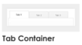
Tab Container Example
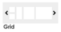
Grid Example
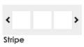
Stripe Example
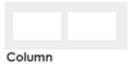
Column Example
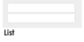
List Example
Menu Example


Structuring Content
Since Release 25 the Developers Toolkit has been updated and will now no longer allow you to implement impossible or irrelevant combinations of sections and content. The table below should explain which items you are able to implement in which order.
| - | Section(c) | Page(c) | Link(c) | Widget(c) | Subsite(c) |
|---|---|---|---|---|---|
| No Section (Tab Container)(p) | Yes | Yes | No | Yes | Yes |
| Slider(p) | Yes | Yes | Yes | No | Yes |
| Column(p) | Yes | Yes | Yes | Yes | Yes |
| Grid(p) | Yes | Yes | Yes | No | Yes |
| Stripe(p) | Yes | Yes | Yes | No | Yes |
| List(p) | Yes | Yes | Yes | Yes | Yes |
| Menu(p) | Yes | Yes | Yes | No | Yes |
| Hamburger(p) | Yes | Yes | Yes | No | Yes |
| - | - | - | - | - | - |
| Page(p) | Yes | Yes | Yes | No | Yes |
| Link(p) | No | Yes | Yes | No | Yes |
| Widget(p) | No | No | No | No | No |
| Subsite(p) | No | No | No | No | Yes |
Settings
On the right-hand side of each item in your tree view you will see a cog  icon. Clicking on this will give you the option to:
- Add Section
- Add Page
- Add Link
- Add Widget
- Add Subsite
- Edit
- Mark as Favourite
- Copy Element
- Preview
If the icon is greyed out and will not let you click on it, then this means that you cannot technically add that item to whatever you are trying to add it to. Instead of allowing you to add something, only to find out afterwards that it doesn't work, this prevents you from doing that in the first place.
Adding a Section

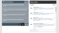
To add a new section to your site you can either click on the blue Add Section banner or click on the Add Section icon in the menu next to the area of your site you want to add the new section to. Clicking on either will take you to the Create Section page which can be seen to the right. At the top of the page you have the option to make the section live or draft by flicking the switch. To create your section you must fill in the following fields:
Title - Give your new section a name.
Display As - Use the drop-down to select what sort of page you would like your section to display on. You can choose from Tab Container, Slider, Column, Grid, Stripe, List, Menu, Hamburger Menu or Megamenu.
There are also several additional options which are not mandatory:
Display in Menu - Tick to display in the menu.
Display Title - Tick to display the title of the section on your site.
Display in URL - Tick if you want to display the URL.
Breadcrumb Required - Tick this to display the section's breadcrumb.
CSS Id - Here is where you would add the CSS Id to apply styling for this section.
CSS Class - Here is where you would add the CSS Class to apply styling for this section.
Don't forget to click Save when you are finished!
Adding a Page

To add a new page to your site, simply click on the Add Page icon in the menu. You will then be presented with with the page shown to the right, which follows a similar format to the Add Section page. Below are the fields you will come across when creating a new page on your site.
| Field | Description |
|---|---|
| Title* | Required Enter a title for your page. |
| Content | This is where you add the main body of your page. |
| Display As* | Required Select how you would like your page to display. You can choose between Thumbnail and HTML Content. |
| Display Size | Select the block size for your page. You can choose from One by One(148px x 148px), One by Two(148px x 296px), Two by Two(296px x 296px), Three by Two(444px x 296px), Four by Two(592px x 296px), Five by Two(740px x296px) and Six by Two(1024px x341px). |
| Image* | Required Here is where you will upload an image for your page. |
| Summary | This is where you can add a summary of your page. |
| Title Required | Tick this box if you want to display the page title on the page. |
| Custom Text Required | Checking this box will present you with a Required Custom Link Title textbox, which allows you to customise the link text. |
| Show left navigation menu | Unticking this box will allow you to hide the menu which appears on the left-hand side of the page. |
| Breadcrumb Required | Ticking this box shows the breadcrumb. |
| Hide from all Navigation | Ticking this box hides this page from the navigation menu. Therefore allowing you to create hidden pages which can only be found be entering the specific URL. |
| Start Date/Timing & End Date/Timing | These two boxes allow you to select the dates and times that you want your page to appear and/or disappear on your site (only use if you do not want your page to appear instantly on your site). |
Adding a Link
Adding a Widget
Adding a Subsite
Copy Elements
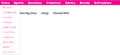
Search Pages

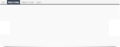
In the Developers Toolkit, click on the Search Pages tab to view an exhaustive liat of all the elements which are on your site, see screenshot to the right. This list is searchable by clicking on the filter icon in the top right corner of the list. The information which is shown about each element in the list includes: Page Type, Title, URL, Created At, Updated At and Status. Hovering over the icon will give you the option to edit  that particular element.
Favourites

Clicking on the Favourites tab in the Developers Toolkit section will take you to a list of all pages that you have marked as favourites. This is useful for marking pages which need to be edited frequently, giving you quick and easy access without trying to look for them/search on the Pages Tree View or Search Pages. Similarly to Search Pages this list can be searched by clicking the filter and the information which is displayed about each element includes: Page Type, Title, URL, Created At, Updated At and Status. Hovering over the icon wil give you the option to edit or remove from Favourites.
Appearance

The Appearance Page under Developers Toolkit is avaliable to Unions who have the Advanced Developers Toolkit. The Manage Themes Page, which can be seen to the right, shows the UnionCloud standard theme and any others themes that have been added to your site. If you would like to add a new theme please contact the Zendesk.
The other two tabs in this section are Global CSS and Global JAVASCRIPT, which will allow users with technical knowlegde to edit the code of the site.
Others
You may have noticed that we skipped over Articles, Resources and Images, that's because they are just more links to move back to those sections, rather that directly changing content.