Difference between revisions of "Web Site Manager"
| (16 intermediate revisions by 2 users not shown) | |||
| Line 1: | Line 1: | ||
| − | [[File:WebsiteManager EditMode.PNG|thumb| | + | [[File:WebsiteManager EditMode.PNG|thumb|Edit Mode Switch On/Off]] |
| + | The Website Manager, is the easy to use, easy to navigate '''Front End''' site editor. It allows users to edit bits of the website without necessarily having to delve into the [[Developers Toolkit]], make simple edits, write new News Stories, add New Events, New Groups etc. | ||
| + | |||
| + | Once you are logged into your UnionCloud Website a {{cog}} icon will constantly float on the left-hand side of your website. All you need to do is click the {{cog}} and the menu to the right will appear, allowing you to turn on and off edit mode. There is also the option to view draft content on the site, before making it live. | ||
| + | |||
| + | == Homepage Scroller == | ||
[[File:WebsiteManager EditScroller.PNG|thumb|desc]] | [[File:WebsiteManager EditScroller.PNG|thumb|desc]] | ||
| − | [[File: | + | This is one of the most commonly edited sections of many Unions, UnionCloud homepages, most unions tend to update the content in this section week to week, and it is used for everything from advertising events and campaigns, to just general information or showing off photos. |
| − | [[ | + | |
| − | [[ | + | The simplest way to picture this, is as a 6 x 2 Grid, it's actually more, as you can have it scroll through multiple boxes, but at any one time, there will be space for 6 boxes on the scroller. a 1x1 box, has a dimension of 148 pixels, by 148 pixels, all other permutations of the squares are multiples of this. It's entirely up to you how you fill and arrange your grid. You could choose simply to display 12 1x1 boxes, or 3 2x2 boxes, or you can mix and match. |
| + | [[File:HomepageScroller ImagesSizes.png|thumb|Image showing a Homepage Scroller, and all the possible content sizes.]] | ||
| + | ===Content Sizes=== | ||
| + | |||
| + | The New Tab 'Display Type' should be 'Grid' | ||
| + | |||
| + | *1x1 <code>148px x 148px</code> | ||
| + | *1x2 <code>148px x 296px</code> | ||
| + | *2x2 <code>296px x 296px</code> | ||
| + | *3x2 <code>444px x 296px</code> | ||
| + | *4x2 <code>592px x 296px</code> | ||
| + | *5x2 <code>740px x 296px</code> | ||
| + | *6x2 <code>888px x 296px</code> | ||
| + | |||
| + | As you can see in the image to the right hand side, the 3x2 image is slightly off the edge of the display, as are the 4x2, 5x2, and the 6x2, which I've illustrated below, if it is set to auto scroll through these will move along one space at a time, until it reaches the end of the images in a particular tab, and moves to the next one. To add more content, simply over over the blue 'Add Image' button, and choose to [[Add Page]], or [[Add Link]]. | ||
| + | |||
| + | Adding a Link, you can load in image (PNG / JPG), at one of the relevant sizes above, which will link to another page / module / event / external link should you wish. | ||
| + | |||
| + | Adding a Page, allows you to load HTML Content into a box at the sized outlined above, which allows you to do more creative things, if you have the knowhow you could write HTML / JS to put a countdown timer into a box, or many other objects or elements, though one of the most common ways people use this is to load a GIF, as if you load a GIF as an image, via the 'Add Link' button, it will be static.<br/> | ||
| + | |||
| + | |||
| + | ==Other Add Content Options== | ||
| + | Many of the widgets that you can add to different pages of the website have small little buttons on, that enable you to quickly add the relevant type of content to the page with. | ||
| + | |||
| + | === Article Widget === | ||
| + | This Icon takes you straight to the Events Dashboard to Add / Manage your Articles | ||
| + | |||
| + | === Event Widget === | ||
| + | This Icon takes you straight to the Events Dashboard to Add / Manage your events | ||
| + | |||
| + | === Groups Widget === | ||
| + | This Icon takes you straight to the Events Dashboard to Add / Manage your groups | ||
| + | |||
| + | === Resource Widget === | ||
| + | This Icon takes you straight to the Events Dashboard to Add / Manage your resources (files) | ||
| − | + | <gallery> | |
| + | File:WebsiteManager AddArticle.PNG|Add Article | ||
| + | File:WebsiteManager AddEvent.PNG|Add Event | ||
| + | File:WebsiteManager AddGroup.PNG|Add Group | ||
| + | File:WebsiteManager AddResource.PNG|Add Resource | ||
| + | </gallery> | ||
Latest revision as of 14:22, 2 July 2018
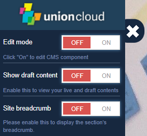
The Website Manager, is the easy to use, easy to navigate Front End site editor. It allows users to edit bits of the website without necessarily having to delve into the Developers Toolkit, make simple edits, write new News Stories, add New Events, New Groups etc.
Once you are logged into your UnionCloud Website a ![]() icon will constantly float on the left-hand side of your website. All you need to do is click the
icon will constantly float on the left-hand side of your website. All you need to do is click the ![]() and the menu to the right will appear, allowing you to turn on and off edit mode. There is also the option to view draft content on the site, before making it live.
and the menu to the right will appear, allowing you to turn on and off edit mode. There is also the option to view draft content on the site, before making it live.
Contents
Homepage Scroller
This is one of the most commonly edited sections of many Unions, UnionCloud homepages, most unions tend to update the content in this section week to week, and it is used for everything from advertising events and campaigns, to just general information or showing off photos.
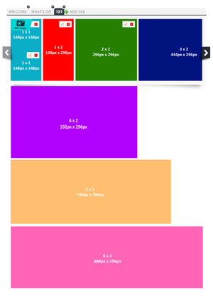
The simplest way to picture this, is as a 6 x 2 Grid, it's actually more, as you can have it scroll through multiple boxes, but at any one time, there will be space for 6 boxes on the scroller. a 1x1 box, has a dimension of 148 pixels, by 148 pixels, all other permutations of the squares are multiples of this. It's entirely up to you how you fill and arrange your grid. You could choose simply to display 12 1x1 boxes, or 3 2x2 boxes, or you can mix and match.
Content Sizes
The New Tab 'Display Type' should be 'Grid'
- 1x1
148px x 148px - 1x2
148px x 296px - 2x2
296px x 296px - 3x2
444px x 296px - 4x2
592px x 296px - 5x2
740px x 296px - 6x2
888px x 296px
As you can see in the image to the right hand side, the 3x2 image is slightly off the edge of the display, as are the 4x2, 5x2, and the 6x2, which I've illustrated below, if it is set to auto scroll through these will move along one space at a time, until it reaches the end of the images in a particular tab, and moves to the next one. To add more content, simply over over the blue 'Add Image' button, and choose to Add Page, or Add Link.
Adding a Link, you can load in image (PNG / JPG), at one of the relevant sizes above, which will link to another page / module / event / external link should you wish.
Adding a Page, allows you to load HTML Content into a box at the sized outlined above, which allows you to do more creative things, if you have the knowhow you could write HTML / JS to put a countdown timer into a box, or many other objects or elements, though one of the most common ways people use this is to load a GIF, as if you load a GIF as an image, via the 'Add Link' button, it will be static.
Other Add Content Options
Many of the widgets that you can add to different pages of the website have small little buttons on, that enable you to quickly add the relevant type of content to the page with.
Article Widget
This Icon takes you straight to the Events Dashboard to Add / Manage your Articles
Event Widget
This Icon takes you straight to the Events Dashboard to Add / Manage your events
Groups Widget
This Icon takes you straight to the Events Dashboard to Add / Manage your groups
Resource Widget
This Icon takes you straight to the Events Dashboard to Add / Manage your resources (files)


